Copy of Copy of Processing Simulation Results
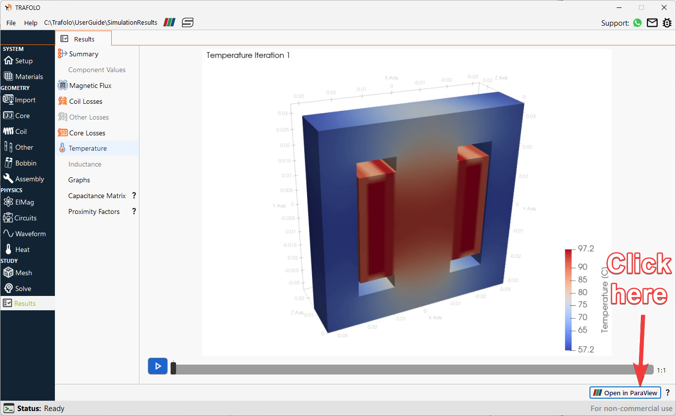
TRAFOLO automatically performs post-processing after the simulation is successfully completed, which can be viewed in the Results tab. For more deeper analysis of simulation data, users can open the simulation results in ParaView by clicking on the “Open in ParaView” button found at the bottom corner of the Results tab. Alternatively, users can also open ParaView and import the results folder for post-processing.
Transient simulations are used for non-sinusoidal waveforms or non-linear scenarios where sinusoidal excitations produce non-sinusoidal responses, such as in saturated cores where the B-H hysteresis curve exhibits strong non-linearity.
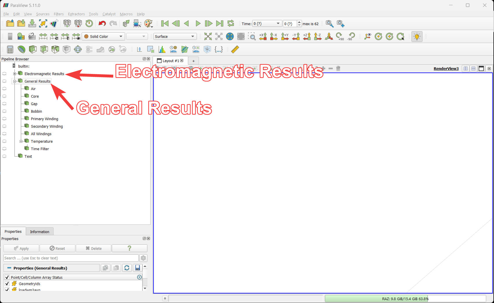
ParaView Results Interface
For the Dual Active Bridge case, the results loaded into ParaView have two categories.
- Electromagnetic Results: Electromagnetic results are for transient time series in electromagnetics.
- General Results: General results are for post-processed or temperature results with average values.
Visualizing Results
- Enable (by clicking on the eye icons “👁”) filters in the ParaView tabto visualize fields applied to different geometries.
- Click on the Electromagnetic Results to visualize magnetic flux distribution, the results of the action are as shown below.
Visualization Examples
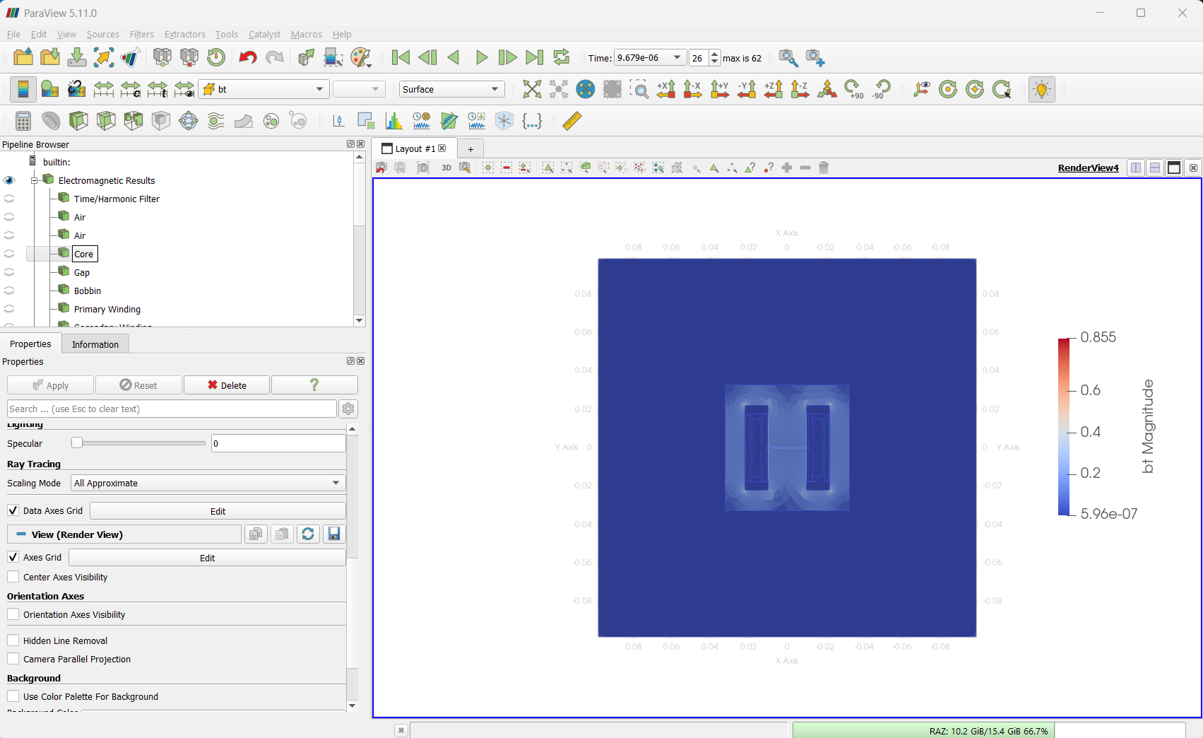
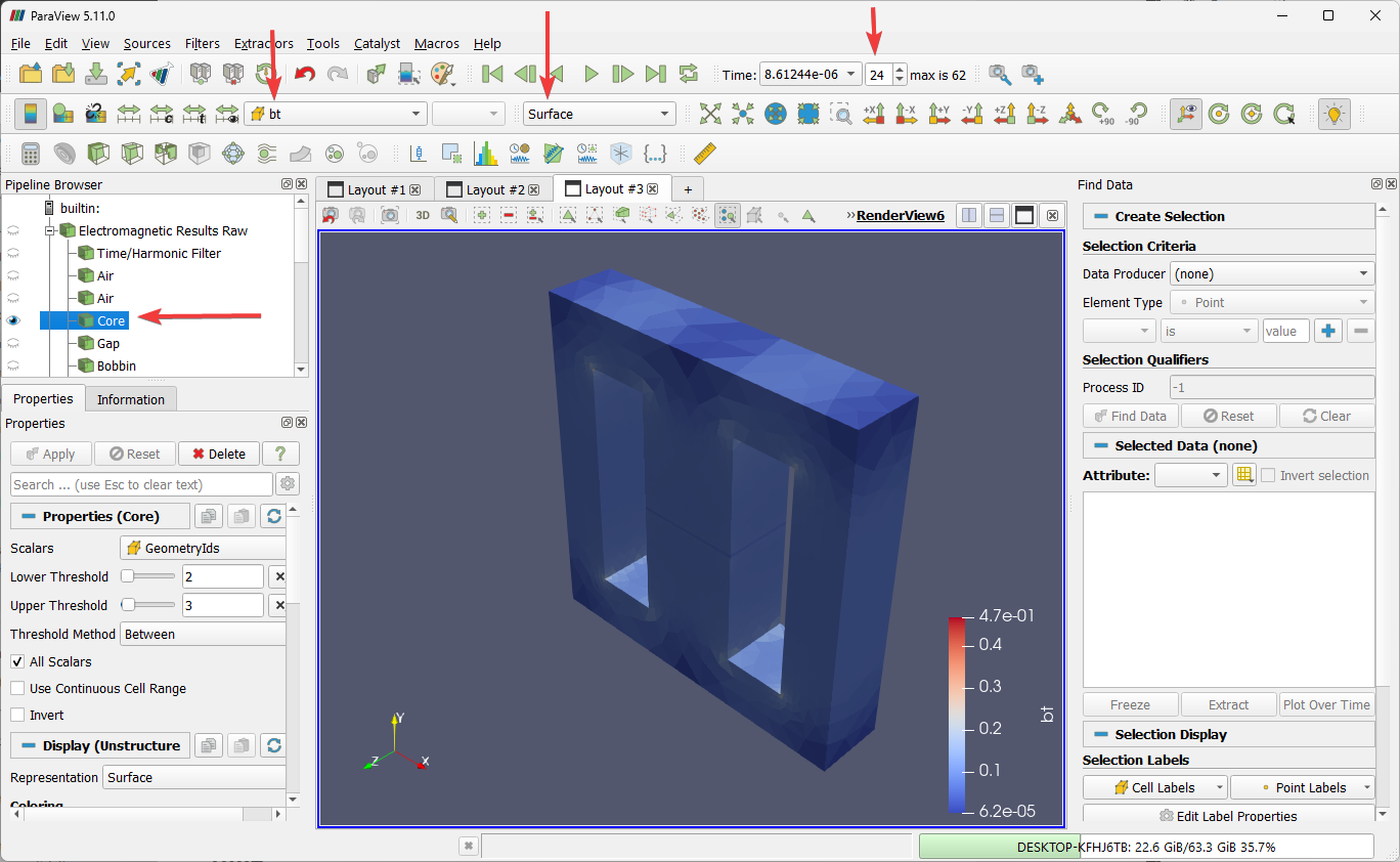
- The example in the figure below shows Core under Electromagnetic Results Raw branch of the tree, showing bt at the surface condition for 24th time step.
- Similarly, other parameters such as current density, load, loss factor, magnetic flux can be visualised for relevant structures/parts of the simulation setup.
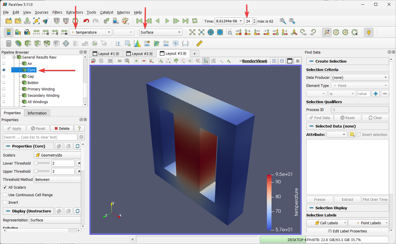
- In General Results Raw branch, we can visualise temperature for the same Core as shown in following figures.
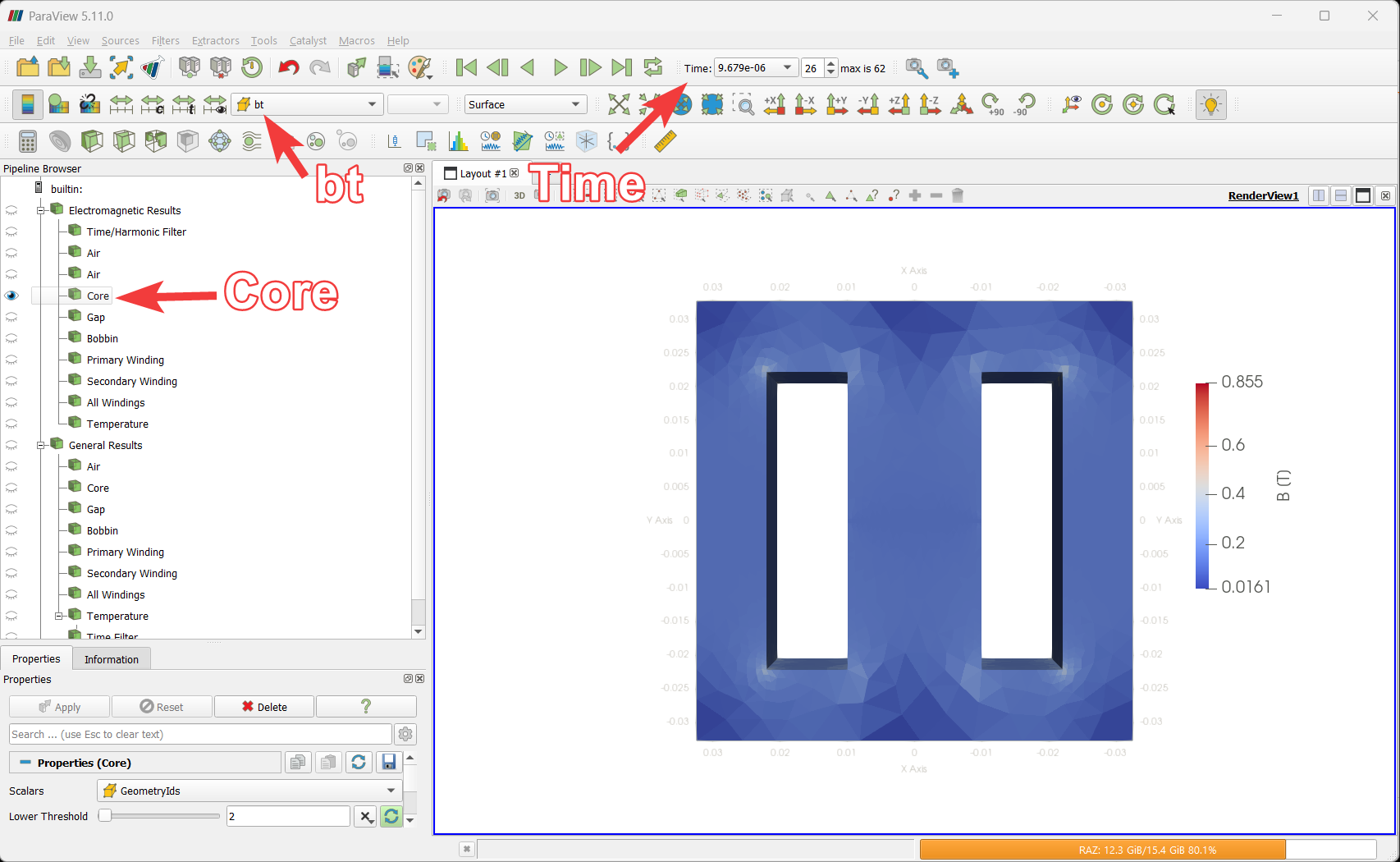
- Enable the eye icon “👁” with the Core name to visualize magnetic flux distribution in the core.
- Choose the bt field intheParaView tab to visualize magnetic flux in Tesla.
- Change the visualized time by selecting Time in the time toolbar from the dropdown or click play to see values as a video.
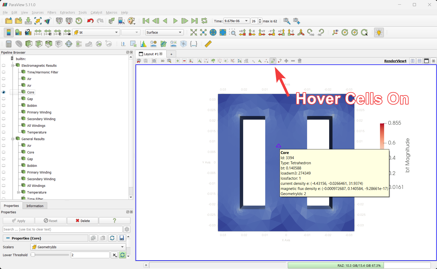
- Click on the Hover Cells On buttonin the render toolbar, then hover over Core to see field values.
Visualizing Magnetic Flux Value over Time
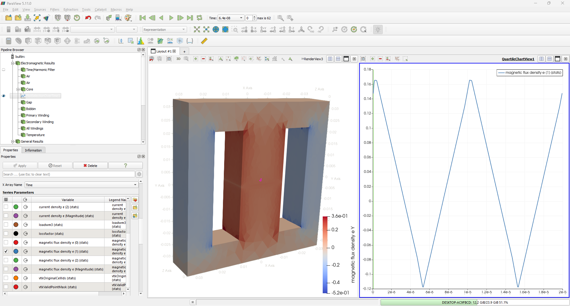
The feature Hover Cells On shows the instantaneous attribute values for one particular cell, a much more informative and useful infographic would be graphical representation of the same over the entire simulation time period. Users can visualise this by using the Plot Selection Over Time filter.
- Select the option Interactive Select Cells On and click on a desired cell location.
- Select Plot Selection Over Time filter and click apply under the Properties column on the left side of the window.
- Select a desired parameter under Series Parameters cell to visualise this. Here the graph for Magnetic Flux Density distribution is shown.
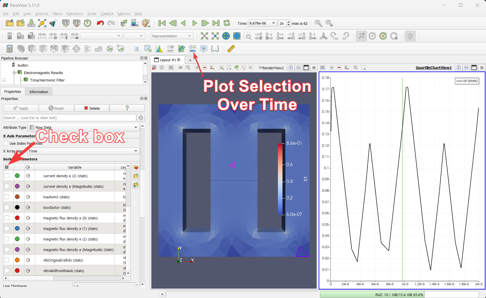
- The graph in the above figure shows the just the amplitude of the Magnetic Flux Density. To get the positive and negative waveform and values, select a different parameter from the ParaView Series Parameters tab. Similar case example is shown in below figure.